2/26/2011

Grenelle Tower for Paris by Atelier Zündel and Cristea Architects

Another tower which aims at sustaining existing cities is the Skyproject project for the city of Paris. French agency Atelier Zündel and Cristea Architects has participated in the Skyscraper competition 2010 organized by evolo magazine.
Grenelle Tower, Paris, © Atelier Zündel and Cristea Architects
 
Paris, obviously, does not face rapid population growth and rapid urbanization such as Mumbai — I referred to my previous article the TATA Tower which goal — compact tower for a new type of housings and offices — is quite similar but different spatial constraints.
© Atelier Zündel and Cristea Architects

Paris — the Grand Paris is an illustration— is shifting into a 21st Century. Paris cannot import American model such as geographic, territorial expansion due to its urban morphology and history. The construction of high-rise towers in Paris, then, is still a hot discussion between pro and cons.
© Atelier Zündel and Cristea Architects

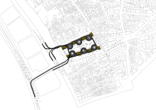
Atelier Zündel and Cristea Architects circumvent this issue with a compact tower that respects Paris identity. They envision a tower that is inscribed into the diversity of Paris, Paris with its uniform building —home, offices, shops — fabric, its rapid transportation network, its parks, its avenues.
© Atelier Zündel and Cristea Architects

The firm starts with an initial volume that they considered a "spatial texture". This "spatial texture" is a vertical stack of slabs of a height of 200 meters.
© Atelier Zündel and Cristea Architects

A dynamic formation process has been applied utilizing an empty tube of manifold geometry.
© Atelier Zündel and Cristea Architects

In motion, this cavity becomes a generator of space, a dynamic, fluctuating, and evolving construct. Its topology will delineate such properties as proximity, contiguity, continuity.
© Atelier Zündel and Cristea Architects

Building facts
Project: Grenelle Tower
Program: Multiactivities skyscraper
Architects: Atelier Zündel and Cristea Architects
Location: Paris, France
Size: 168 000 sqm
Status: Competition 2010
Client: evolo magazine

TATA Tower by Illinois Institute of Technology B. Arch students Seth Ellsworth and JaYoung Kim

Two Illinois Institute of Technology B. Architecture students Seth Ellsworth and JaYoung Kim designed a tower with the aim of challenging Mumbai's territorial issues. The TATA Tower will sustain struggling Mumbai; it consists of a high density and compact tower for TATA employees and their cars. Their research on Mumbai city articulated three elements: Mumbai faces old infrastructures. Public transportation cannot respond to the population demands due to a high density of population.

TATA Tower, Mumbai, India, © Seth Ellsworth and JaYoung Kim

Due to Mumbai's territorial constraints, Mumbai has unusually high urban densities with an average density that surpasses 27,000 people per square kilometers. Built-up area included, the average density rises above 50,000 people per square kilometers.
Mumbai density © urban age

The analysis of spatial structure of Mumbai — other Indian cities included — reveals an intense and compact arrangement of buildings and structures. It is difficult to answer if the two students have taken this factor into account but their TATA Tower  conforms with Mumbai's search for a compact city.
Mumbai Urban morphology © urban-net

The second part concerns the city's landmass. According to surveys, 25 percent of the city's landmass will be used as parking space by the year 2030. The third and last element, the client TATA company which manufactures the world's cheapest cars.
© Seth Ellworth and JaYoung Kim

The addition of these three elements results in a multi-function tower. The TATA Tower can house both residences and offices for the TATA employees in Mumbai. A high density parking garage which consists of the full height of the tower will host employees' cars. According to the two students' research, 930 dwellings and 4,050 parking spaces can fit in the tower.
© Seth Ellworth and JaYoung Kim

The other particularity of Seth Ellsworth and JaYoung Kim's design is the green uses, mostly composed of parks and green spaces. An algae farm will also serve as an energy generator.
Site © Seth Ellsworth and JaYoung Kim

Ellsworth and Kim's TATA Tower poses important questions on designing housing and offices in cities with high densities such as Mumbai,  Bangalore, Delhi, but also, Mexico, to quote but a few. Their project stresses the urgent necessity to design buildings, spaces as well as streets that play a crucial role in securing living conditions and flexibility of urban environments that are facing intense processes of change.
© Seth Ellsworth and JaYoung Kim


source: evolo


2/25/2011

News: Arena 92 Stadium for the city of Puteaux by Atelier Christian de Portzamparc

Atelier Christian de Portzamparc, in association with Vinci Group, was elected amongst the three last finalists for the construction of the Racing-Metro-92, also known as Arena 92 Stadium, a French rugby club, in the city of Puteaux, western suburbs of Paris.
Arena 92 Stadium, Puteaux, France, © Atelier Christian de Portzamparc

The project is announced to be the most modern multi-function complex in Europe. The 32 to 40,000 places stadium has an operable roof and can be transformed into an enclosed concert venue. The project that should be completed in 2014 also includes 30.000 square meters of office and shops programs.
Aerial perspective © Atelier Christian de Portzamparc
© Atelier Christian de Portzamparc

Building facts
Project: Arena 92 Stadium
Program: Stadium, concert hall, offices and shops programs
Architect: Atelier Christian de Portzamparc
Team project: Bruno Dubecq, Daniel Romeo, Duccio Cardelli, Étienne Pierres, Céline Barda, Marion Barray, Bertrand Beau, Barbara Bottet, Julie Bouccara, Yannick Bouchet
Collaborator: VINCI Group
Fluids: SNC Lavalin
Structural Engineers: Structures Île de France
Acoustics: Avel Acoustique
Scenography: Duck Sceno
Security Consultants: CSD Faces
Facade lighting: Light it be
Facade: RFR
Client: Ovalto Investissement
Surface areas: 117,000 sqm SHON
Location: Puteaux, Grand Axe de la Défense, 92000 Nanterre, France
Construction start: 2011
Status: Ongoing
Completion year: Expected in 2014
Credits: Atelier Christian de Portzemparc

Images source: architopik

Opera House in Izmir, Turkey by Emrah Cetinkaya

Architect Emrah Cetinkaya unveils his interesting Opera House design proposal for the city of Izmir, Turkey. The focus is art as "a great role in showing what happens in human beings' life (…)".
Opera House, Izmir, Turkey, © Emrah Cetinkaya

As I mentioned in a previous post, as art centers' visitors are now thought as active participants rather than passive viewers, art centers design must integrate these new parameters, at least envision them as starting point. Emrah Cetinkaya's design takes these elements into account.
© Emrah Cetinkaya

This building is an elongated, serpented building that will also acts as a symbol for the city of Izmir.
© Emrah Cetinkaya

The building design, its shape and its inscription on site, will be a connection point between citizens, art and artist's works.
© Emrah Cetinkaya

Its free-form geometrical shape is the outcome of the parametric topography analysis: Perceptual data's, vista areas, vehicular and pedestrian areas, functional connections and meteorological factors.
© Emrah Cetinkaya
Overall, Emrah Cetinkaya's Opera house design proposal reminds me Zaha Hadid's Performing Arts for Abu Dhabi, this elongated, serpented-shaped building and its parametric green areas. I cannot affirm that Emrah Cetinkaya has inspiration from Zaha Hadid's projects, but similitude in terms of design — that is shape, facade treatment, landscape design thought as a continuity of the Opera house — can be drawn. I suppose Emrah Cetinkaya's Opera house interior spaces may have the same fluidity and smoothness as Hadid's building since free-form geometrical buildings, in general cases, tend to generate smooth, fluid interior spaces that interact with the visitor/user/participant. Consequently, It will be interesting to have an idea of the treatment of the Opera House's interior spaces.

Source: evolo

2/24/2011

Museum of Environmental Science, Guadalajara, Mexico by Snøhetta

Snøhetta's Museum of Environmental Science design proposal for the Centro Cultural Universitario, Guadalajara campus has been selected last December 2010.
The core element of the Museum of Environmental Science Competition was to take into account the natural wealth and environmental problems of the region on which the Museum will focus. The Museum envisions to maintain exhibits on global issues and showcase the latest in green developments.
Snøhetta's sculpture-shaped building design will meld scientific progression and sustainability with a modern and biotic design inspired from the natural landscape of the Guadalajara region.
Museum of Environmental Science, Guadalajara, Mexico © Snøhetta
In many Snøhetta's projects, the site plays a crucial role. The King Abdullah Center for Dialog in Saudi Arabia, the Sheik Zayed National Museum in Abu Dhabi, their plans for a new Marine Technology Research Center in the sea outside Trondheim, Norway or else the Max-Lab IV in Lund, Sweden are among numerous examples of Snøhetta's design methodology. Site, exchanges with clients and users, and research for a new building type that looks to the future are the basis of Snøhetta's design. In the case of the Museum of Environmental Science in Guadalajara, the choice of the building shape and implantation on site is inspired from the site conditions, as well. As mentioned, it was required to take into account that the Museum will focus on environmental problems of the region and latest green developments.

© Snøhetta


The building, white in color, will be modelled which roof has been cut out to generate three outdoor courtyards and gardens as well as create a corridor between the University of Guadalajara's new library and auditorium situated on either side of the Museum. Natural light and ventilation will penetrate inside the building throughout these cut-out sections.

Situation plan © Snøhetta

This results in a white building in harmony with its landscape participating in the wave-type arrangement of the green spaces, mostly made up of trees, that surround the building. These green spaces will be included as a part of the larger municipal planned wilderness reserves set aside by Guadalajara.
© Snøhetta

Rooftop which will act as courtyard will be accessible to the users to take advantage of the spectacular views of the Museum's landscape.
Arup will collaborate closely with Snøhetta for structural MEP, sustainability, acoustics and theater planning.
The Museum will house a library, restaurants, a forum of demonstrations, recreational land, planetarium, classrooms, workshop, and 4 showrooms.
The project is scheduled to begin in early 2011 with a budget of $35 million.
© Snøhetta

Center for Promotion of Science Competition by Milos Zivkovic, Nebojsa Stevanovic, Janko Tadic, Aleksandar Gusic and Slobodanka Tadic

I have already spoken of Wolfgang Tschapeller, who recently was awarded for the competition for the Belgrade Center for Promotion of Science — Sou Fujimoto received the second prize, on a previous post. You may have already seen other proposals such as that of Sadar + Vuga, Dürig AG, to quote a few. I will present Serbian architects Milos Zivkovic, Nebojsa Stevanovic, Janko Tadic, Aleksandar Gusic and Slobodanka Tadic's proposal.

The Concept of this competition first. The Serbian Ministry of Science and Technology launched an international competition for the design of a Center for the promotion of science in one of New Belgrade's neighbourhoods. This competition has been organised by the Union of Architects of Serbia together with the Association of Belgrade Architects and run under the aegis of the UIA.

Candidates were called upon to design a complex that contains exhibition and conference spaces as well as a planetarium. The site measures 11,66 hectares. However only 20,915 square meters have been allocated for the complex. The design proposals must include the urban planning of the site as a science park with the purpose of being integrating in Belgrade's High-tech sector, a university, scientific and commercial neighbourhood.

Since 1990s, and if you are readers of various essays on participative arts among others Nicolas Bourriaud — particularly Relational Aesthetics —, Participative arts call upon an active participation of visitors who become "participants" rather than simple passive visitors. Serbian architects Milos Zivkovic, Nebojsa Stevanovic, Janko Tadic, Aleksandar Gusic and Slobodanka Tadic's design proposal attempts to address this issue.
© Milos Zivkovic, Nebojsa Stevanovic,
Janko Tadic, Aleksandar Gusic and Slobodanka Tadic

The building is rectangular in form with de-leveled staggered slabs that are recessed from the facade.
Isometric diagram © Milos Zivkovic, Nebojsa Stevanovic,
Janko Tadic, Aleksandar Gusic and Slobodanka Tadic

The entire building is conceived as a place in which visitors can interact with spaces, more explicitly exhibition spaces as well as access ramp and conference room.
© Milos Zivkovic, Nebojsa Stevanovic,
Janko Tadic, Aleksandar Gusic and Slobodanka Tadic

The exhibition space is spacious with these de-leveled staggered slabs that generate various perspectives and accentuate modes of interaction of the visitors/participants with the objects displayed as well as the visitors/participants with the exhibition space.
© Milos Zivkovic, Nebojsa Stevanovic,
Janko Tadic, Aleksandar Gusic and Slobodanka Tadic 
© Milos Zivkovic, Nebojsa Stevanovic,
Janko Tadic, Aleksandar Gusic and Slobodanka Tadic

Highest level of the building is compact with dark areas in accordance with different types of exhibitions that will be displayed in the spaces.
Diagram © Milos Zivkovic, Nebojsa Stevanovic,
Janko Tadic, Aleksandar Gusic and Slobodanka Tadic
© Milos Zivkovic, Nebojsa Stevanovic,
Janko Tadic, Aleksandar Gusic and Slobodanka Tadic

The facade is conceived to act as a filter. Observers from outside can watch through Fresnel lenses which are located on three sides of the Center.
© Milos Zivkovic, Nebojsa Stevanovic,
Janko Tadic, Aleksandar Gusic and Slobodanka Tadic


Building facts
Project: The Center For Promotion of Science design proposal
Architects: Milos Zivkovic, Nebojsa Stevanovic, Janko Tadic, Aleksandar Gusic and Slobodanka Tadic
Consultant: Mihajlo Samardzic
Location: Belgrade, Serbia
Year: 2010
Status: Competition entry
Net area: 11,100 sqm
Credits: Milos Zivkovic, Nebojsa Stevanovic, Janko Tadic, Aleksandar Gusic and Slobodanka Tadic

Source: archdaily

2/23/2011

Update: The New Holmenkollen SkiJump by JDS Architects

If you are a fan of sky, particularly Nordic Ski, you will be happy to learn that the New Holmenkollen SkiJump designed by JDS Architects' will host the 2011 FIS Nordic World Ski Championships 23 February - 06 March 2011.
After this sport break, if you just get interest in JDS Architects' new project for itself — this is my case —, the New Holmenkollen SkiJump finally is completed.
Whatever the purpose of your interest for this SkiJump, it is a fascinating, sculpture-type ski jump that can be used both for sports — first use — second as a landmark for Oslo Municipality.
As I have already presented this project, I will merely update the previous post.

This sculpture-shaped SkiJump is clad in aluminium and glass and rised 58 meters in the air. It cantilevers an impressive 69 meters and on the first day of jumping tests. The record of the longest jump made at Holmenkollen was broken.

Atop the ski jump is a platform where visitors can take in some of the most breathtaking views of Oslo, the fjord and the region beyond. It's a new form of public space, using an unlikely architectural form as its host, affording the same spectacular vantage point for everyone who comes to Holmenkollen.

The following images are latest images, diagrams of the Holmenkollen SkiJump.
Aerial view, Photography © Iwan Baan
Photography © Steven Walters

Photography © Marco Boella/JDS Architects
Photography © Marco Boella/JDS
Photography © Steven Walters
Photography © Marco Boella/JDS
Observation deck, Photography © Steven Walters
© JDS Architects
Axonometry © JDS Architects


Diagram © JDS Architects
Section © JDS Architects


Building facts
Project: New Holmenkollen SkiJump
Program: Sports and Recreation — Ski Jump
Architect: JDS Architects
Client: Oslo Municipality
Completion Year: 2011
Location: Oslo, Norway
Height: 58m
Photography: Marco Boella, Steven Walters, Iwan Baan


Source: JDS Architects Blog

Pageviews last month

Powered By Blogger